Mobile eLearning
Tab Interaction
This mobile tab interaction provides a simple overview of the various classes offered at a local yoga studio. Embedded links to the studio's website serve the dual purpose of driving traffic to the website and guiding users to more detailed information and additional services.
Audience: new and existing yoga studio customers
Responsibilities: eLearning Development, visual design, mockups, website design
Tools Used: Figma, Articulate Storyline, Adobe Illustrator, SquareSpace
The Problem and Solution
I teach at a local yoga and salt therapy studio. Many potential and current customers are unaware or unfamiliar with the many classes offered. Currently, we have a stack of printed class descriptions at the front desk, but this setup looks cluttered due to limited space. Moreover, the printed information is presented in an unappealing manner and can be overwhelming.
I began to wonder about the amount of time and money spent on making copies, the likelihood of copies being lost or discarded, the number of classes unattended due to customers’ lack of information and understanding, and the potential for attracting more clients if they were well-informed about our offerings.
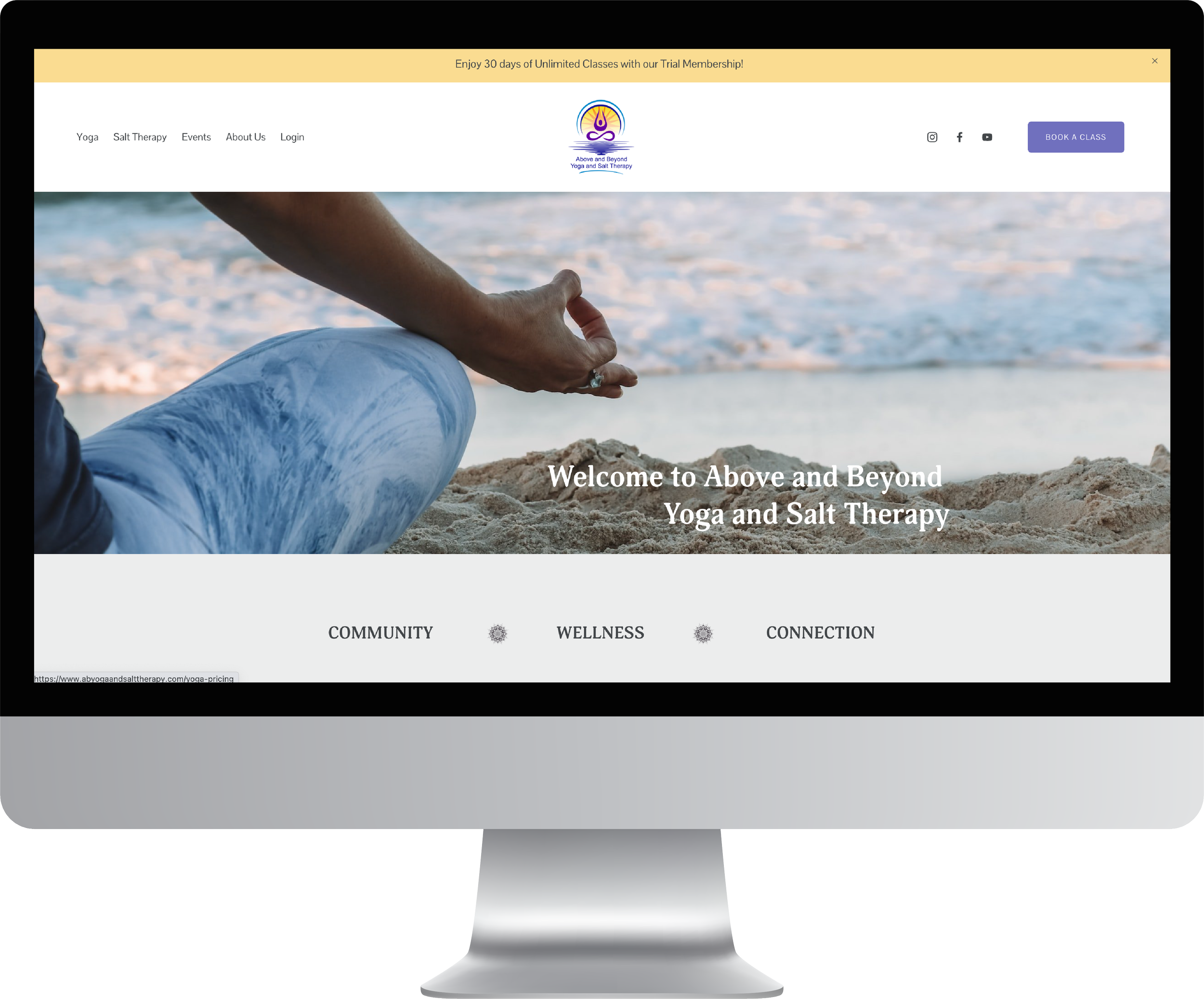
I knew there was a better way to present the information to our customers and conserve resources, so I devised a solution. Given that nearly everyone carries a cell phone, I envisioned a simple tab interaction accessible through a QR code. By scanning the QR code, customers can instantly access and explore information about the various classes. Users could pull the information from the website, but it would take more time and effort. In addition to being a simpler, more streamlined approach to accessing class information, the user is able to track the information they have viewed. They also have the option to enroll in a class right from their phone, either immediately or at a later time. Implementing this user-friendly guide could significantly boost interest, class attendance, and overall sales at the studio.
My Process
I wanted this eLearning experience to be simple, useful, visually appealing, and direct people to the studio website. I designed and developed this simple guide from concept to finished product. A friend and I were in the process of building the studio’s new website, so I was able to match the branding and information from the website to the tab interaction. My process included generating content, refining it through revisions and editing, crafting visual mockups, constructing an interactive prototype, and developing the final deliverable.
I began by gathering details from the desk sheet and the old website. After revising, editing, and adding new content, I organized and condensed the information for the tab interaction
Visual Mockups
I used Figma to craft visual mockups and refine the project's appearance. I began by building wireframes to get a sense of the layout. For efficient organization, I categorized classes into two groups: heated and unheated. I designed two buttons on the main slide - one for each category. Leveraging the style guide I had created for the website. I was able to adapt it for the high-fidelity mockups. This would ensure consistency across the project, website, and brand. Drawing from client discussions and studio experience, I aimed for a sleek, elegant, and minimalistic design. Colors inspired by the studio logo were chosen to evoke a sense of calm. Yoga icons from Freepik were customized using Adobe Illustrator, depicting poses relevant to each class type. Iterating through multiple rounds of feedback fine-tuned the visual layouts. Crafting visual mockups was integral to the process, it allowed me to refine visual elements and led to decisions that significantly improved the quality of the project.
Interactive Prototype
Next, I used the visual mockups and content to develop an interactive protoype using Storyline. The prototype included key sections: the initial slide, a slide for heated classes, one heated class button and slide, a yoga benefits lightbox, a teacher intro slide, and links to the studio website. Since there are numerous classes, I thought it important for the user to be able to track viewed classes. I did this by creating a visitedState and conditioning triggers to activate the visitedState once a class type had been viewed.
To ensure users had enough information to make a decision regarding a class, I incorporated the scrolling panel feature for each class. Above the panel, I positioned a signup button linked to the website's schedule, facilitating seamless class registration and driving website traffic. Specifically designed for mobile use, I incorporated a downState for each button, triggering a visual response upon user interaction. The prototype helped me to test functionality and gave me an opportunity to collect feedback on the structure and feel of the tab interaction before full development.
Final Product
After refining the interactive prototype I developed the entire project. By working out the design elements, triggers, and conditions for the prototype, I was able to quickly develop and replicate the same features to the additional 21 slides.
EXPLORE OTHER WORK


